Gender-inclusive, anti-chafe balm for ALL BODIES
Role: Brand Strategy & Product Identity System
Scope: BALM was developed to address a gap in the endurance market: a high-performance, all-natural anti-chafe product that feels inclusive, modern, and grounded in outdoor culture. I led the brand from concept through execution, defining its strategic positioning, visual identity, packaging architecture, and product system. The result is a scalable brand ecosystem that balances functional credibility with a distinct visual voice rooted in movement, landscape, and community.
Timeline: Summer 2025
-
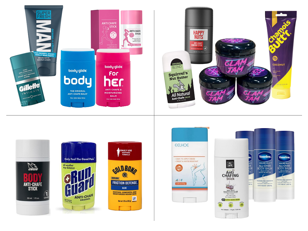
Before BALM, the anti-chafe category operated in tonal extremes: hyper-gendered color coding (pink vs. blue), novelty-driven genital humor, dated athletic graphics, or clinical and generic branding. Despite serving a modern endurance audience, the visual language had not evolved alongside the culture. No brand reflected the athlete who values inclusivity, performance, and considered design in equal measure.
-
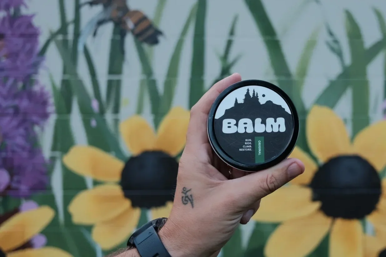
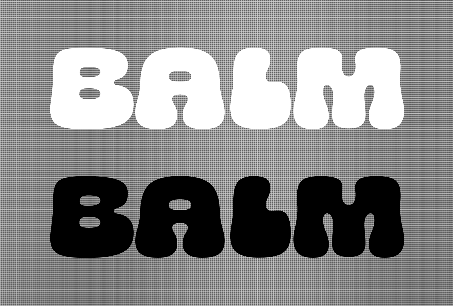
BALM’s primary identity is built around a self-contained wordmark rather than an icon. Expanded, rounded letterforms introduce softness and visual closeness, subtly echoing the natural curves and proximity of skin in motion.
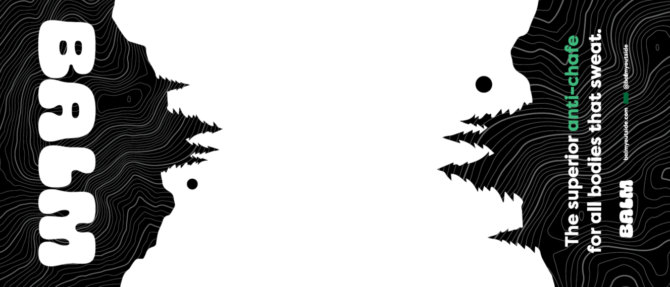
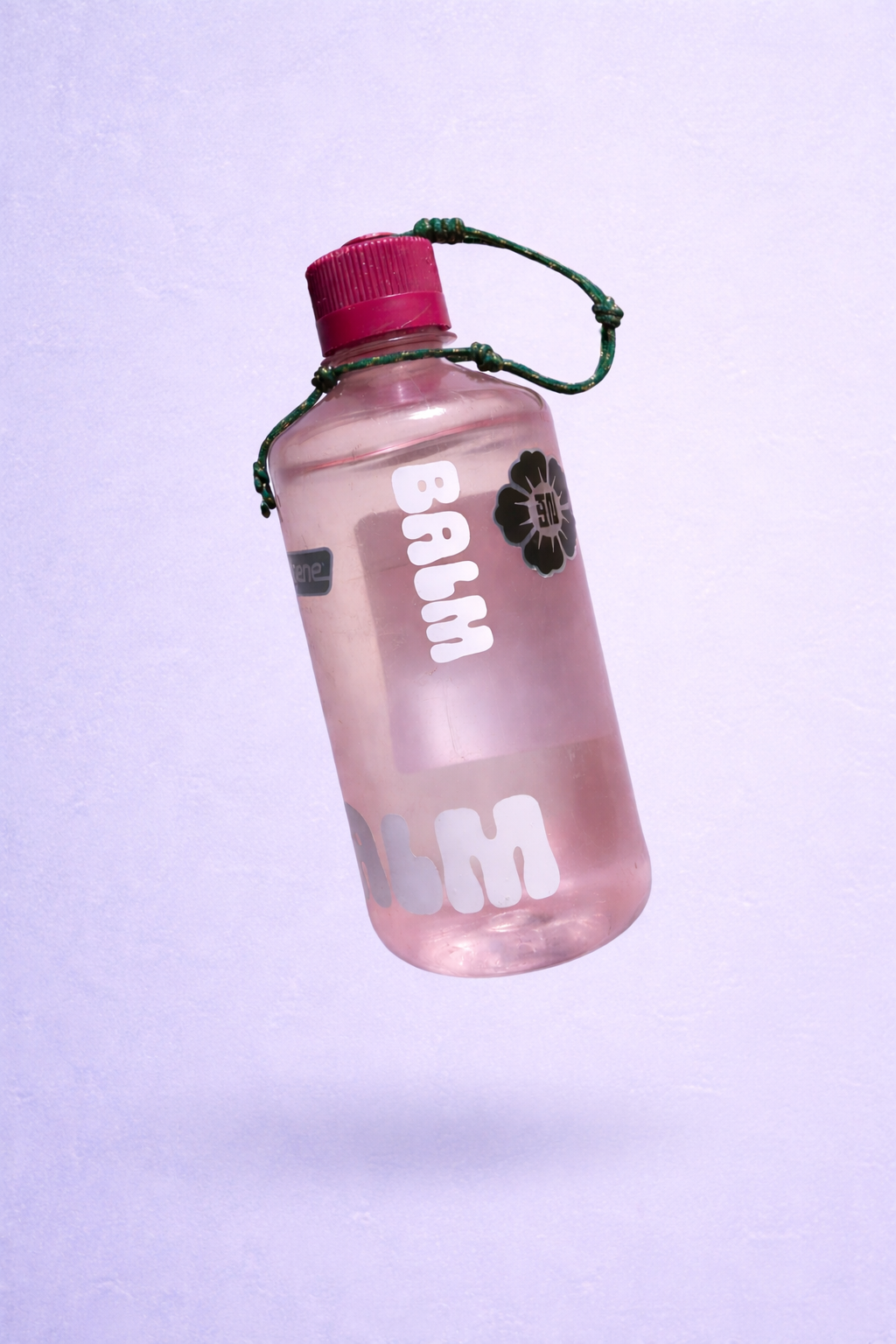
Rendered in high-contrast black and white, the wordmark scales seamlessly across print and digital applications. It functions as a vinyl-cut sticker, social overlay, or sponsor mark on race kits and websites, remaining clear and impactful at both small and large sizes. It also anchors more layered compositions featuring landscape silhouettes and topo textures inspired by Michigan’s Hogback Mountain across packaging and large-scale environments.
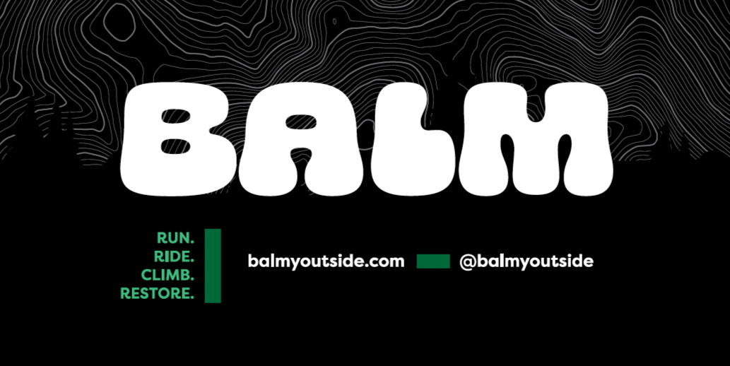
A considered accent color system supports this foundation. Forest green grounds the primary identity, while a brighter tint is reserved for high-visibility applications such as tradeshow signage. Together, these elements form a flexible brand system that balances performance credibility with inclusivity and design clarity.
-
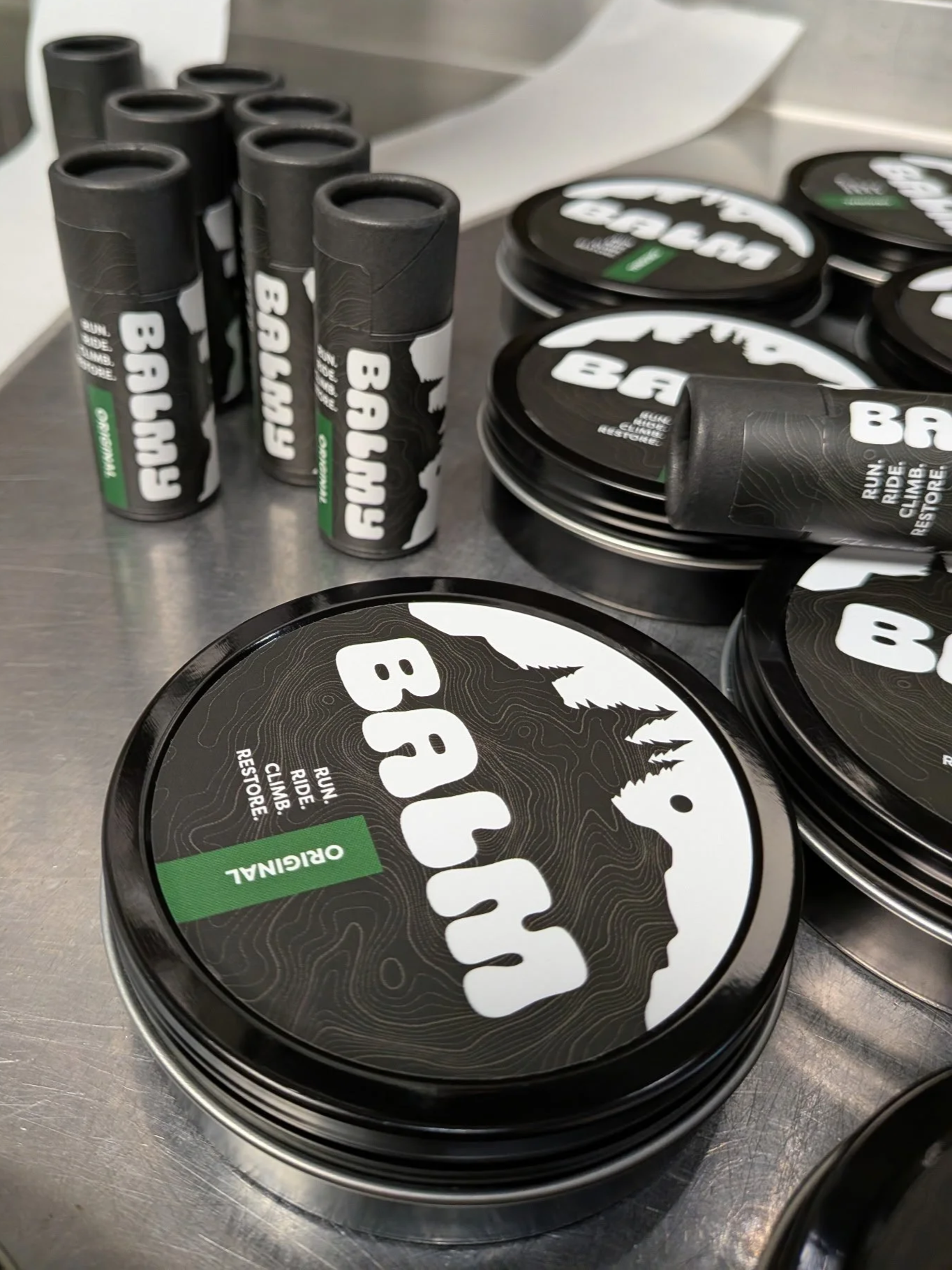
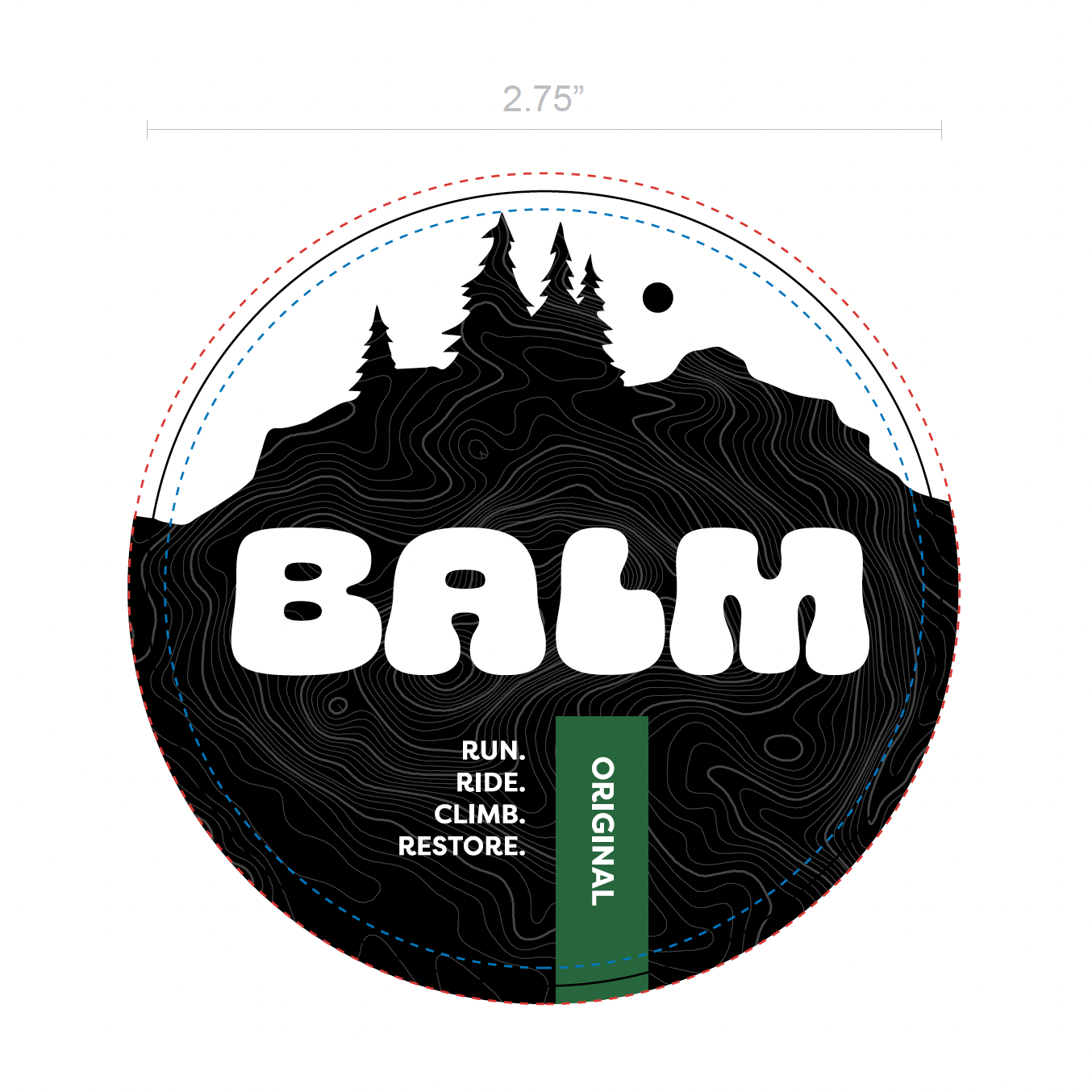
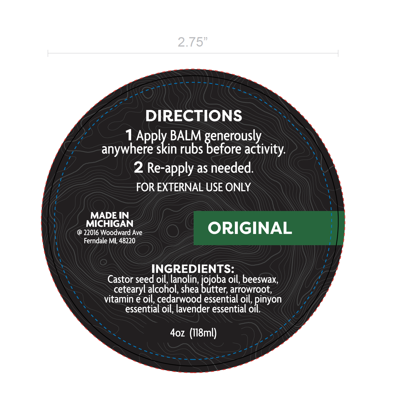
The system adapts across both a round tin and a narrow cardboard tube while preserving hierarchy and legibility. A secondary visual layer introduces a subtle rugged landscape silhouette, grounding the product in its outdoor context. Faint topographic lines of Hogsback Mountain provide a quiet reference to the brand’s Michigan roots.
A deliberate color block establishes scalable system logic to differentiate scent profiles. For the initial launch, forest green signaled “Original,” an earthy, herbal, lanolin-forward formula. The green reinforces gender-neutral positioning and natural outdoor associations while aligning directly with the scent.
Naming Extension
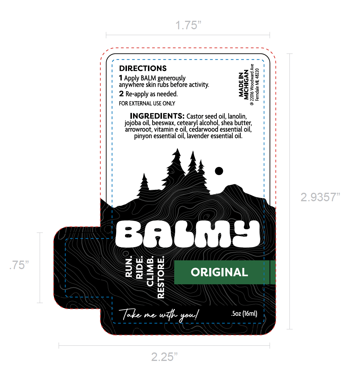
The portable stick was renamed BALMY, introducing a controlled sense of play that positions it as the smaller companion to the full-size tin while maintaining overall brand cohesion.
Visit balmyoutside.com
Design Process
*
Design Process *
Market research
Prior to developing BALM’s identity, I conducted a focused market review and competitive brand audit of leading anti-chafe products. The category clustered into predictable extremes: hyper-gendered color coding, novelty-driven humor, dated graphics, or sterile clinical branding. While the endurance and outdoor communities have evolved, the visual language was falling short. The audit revealed an opportunity for a design-forward, inclusive brand system that balanced performance credibility with cultural maturity.

PRELIMINARY SKETCHES
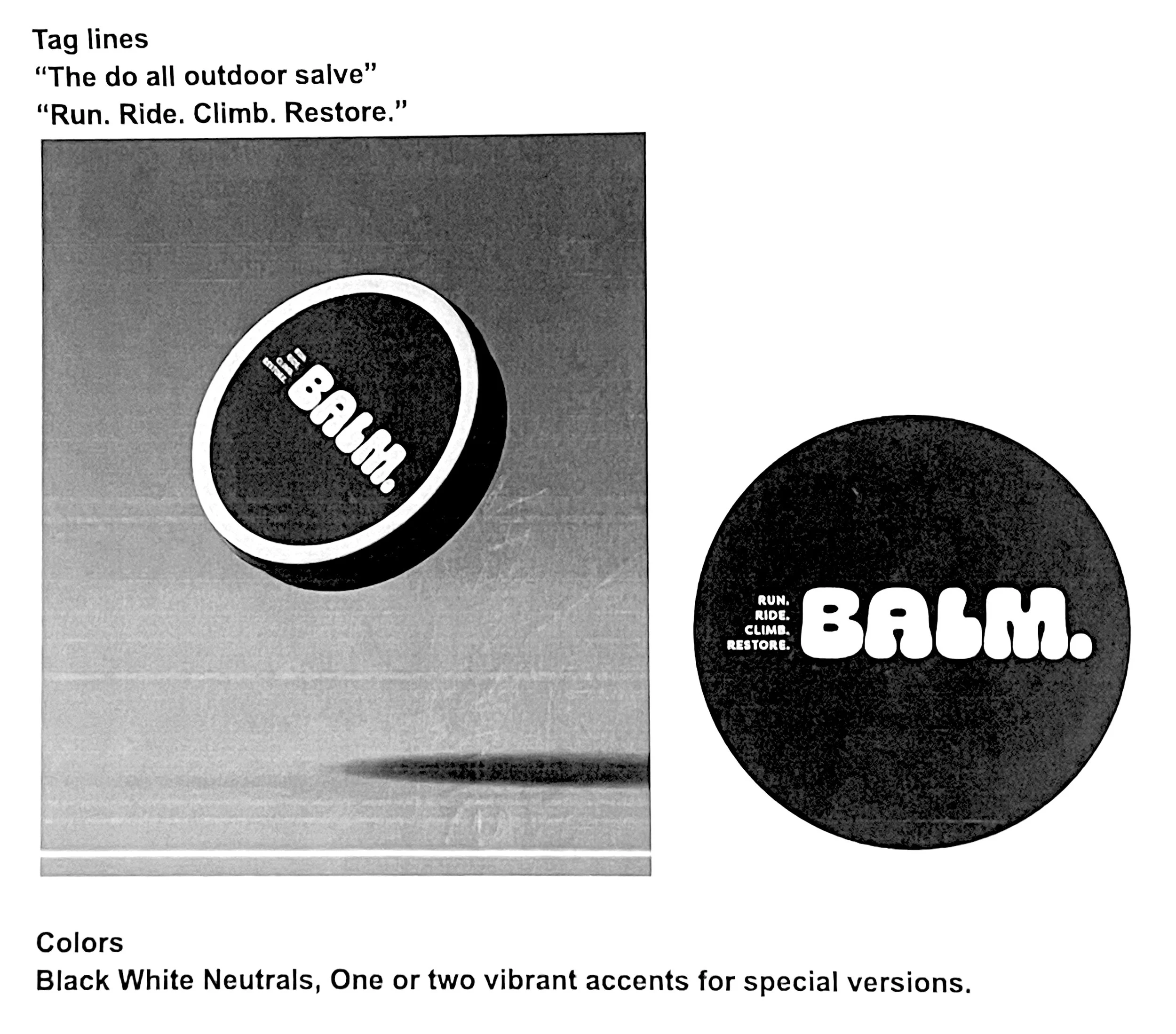
Early sketch explorations focused on circular composition, wordmark hierarchy, and landscape integration across multiple packaging formats. From the outset, I considered how the identity would translate to varied container styles and proportions. Typographic studies contrasted sharper, angular forms with expanded, rounded letterforms to define the brand’s tonal direction through type.
Brand WORDMARK
The final BALM logo is a self-contained wordmark designed to function as the primary brand asset. Because BALM exists at the point of friction, the visual system needed to feel like relief. The curved forms create a sense of soft volume and closeness, giving the wordmark a comforting human quality, and echoing real forms of the body. This positions the brand within an approachable, lived experience rather than a focus on elite bodies and performance culture.
Packaging development
BALM’s visual identity as a typography-forward, high-contrast wordmark was the focus for the packaging design.
What began as a restrained black-and-white label mockup evolved to incorporate a rugged landscape silhouette that incorporates the topography lines of Hogback Mountain, embedding Michigan’s landscape directly into the identity as a nod to the brand’s home state. The bold wordmark remains the focal point of the packaging and is supported by a restrained black-and-white palette with accent color flexibility.
The packaging system was translated to the narrow tube design for BALMY without sacrificing hierarchy, visual texture, or the scent-based color cue, demonstrating adaptability across formats while maintaining consistency and visual integrity.
Website & Socials
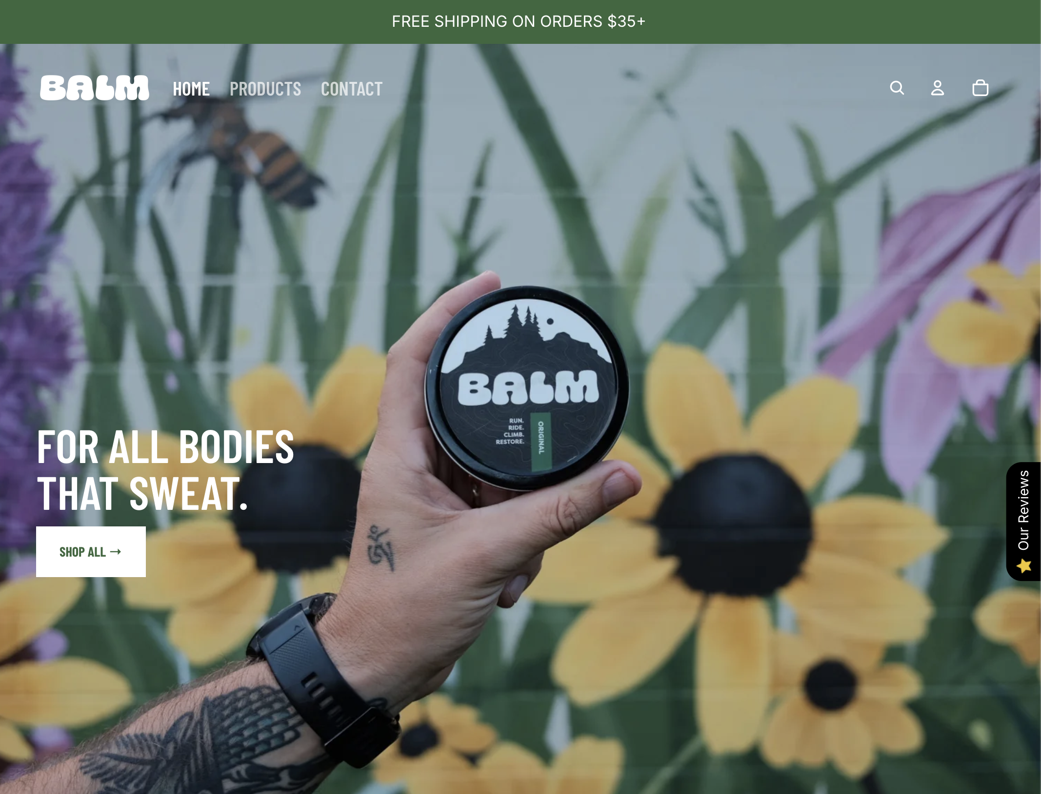
The Shopify site and social media presence extend BALM’s identity into a conversion-focused digital experience. The black-and-white foundation keeps the wordmark and packaging central, while photographs and video of real people using BALM on trails, rides, and everyday movement ground the brand in authenticity. Accent color is applied intentionally to guide attention, maintaining clarity and cohesion throughout.
Instagram: @balmyoutside
Shopify: balmyoutside.com
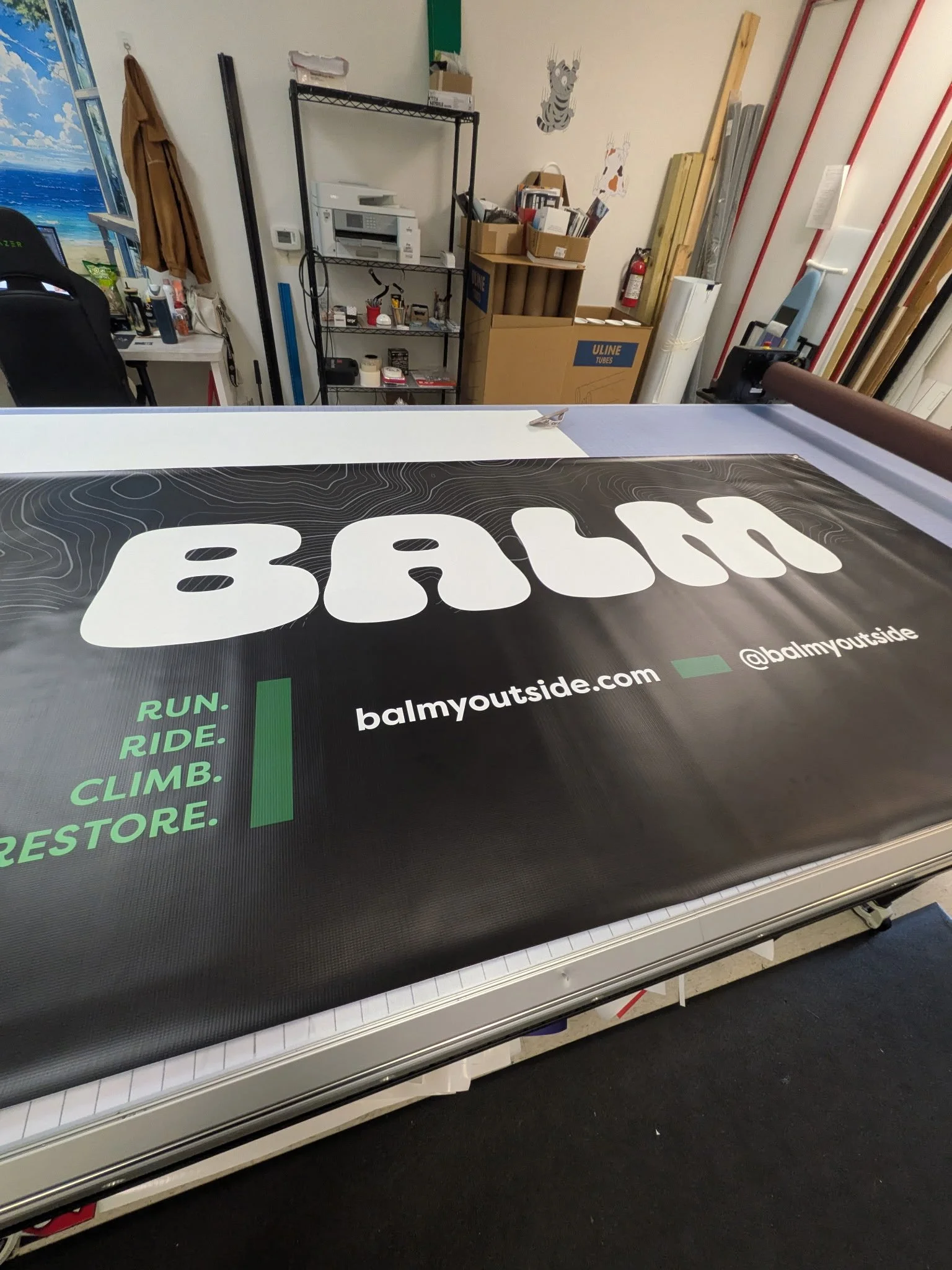
TRADE SHOW DISPLAY & MERCH
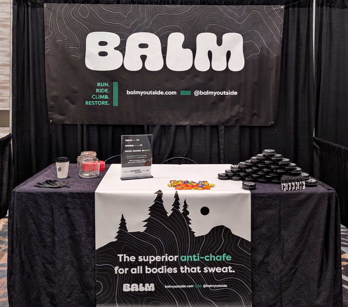
The BALM identity scales seamlessly into the tradeshow environment with the design of a hanging banner and table runner. The oversized, cushioned wordmark commands attention from across the room. The rugged landscape silhouette and topo pattern expand into immersive large-format graphics, while the high-contrast black-and-white palette and precise forest green accent maintain clarity and cohesion. The logo also distills effortlessly into a trendy, simple, and distinctive wordmark vinyl sticker — transforming the core identity into a highly portable piece of merch that feels both design-forward and community-driven.