Unified Cultural CORRIDOR Banner System
Role: Environmental Graphic Design & Civic Brand Unification
Scope: Commissioned by the Flint Cultural Center Corporation, this project introduced a unified environmental banner system along the Cultural Center corridor spanning sixteen double-sided poles. The design establishes a district-level identity through a modular framework built for long-distance legibility, interchangeable installation, and a contemporary civic presence.
Timeline: Spring 2023
-
The Flint Cultural Center serves as a shared civic destination housing multiple independent institutions along E. Kearsley Street. The previous banner system lacked cohesion, with fragmented typography and decorative elements that reduced long-distance legibility. Rather than presenting a unified district, the corridor read as visually inconsistent and institution-specific.
The objective was to create a cohesive environmental identity across sixteen double-sided poles—improving clarity, integrating with the existing wayfinding system, and shifting emphasis from individual organizations to a district-level presence.
-
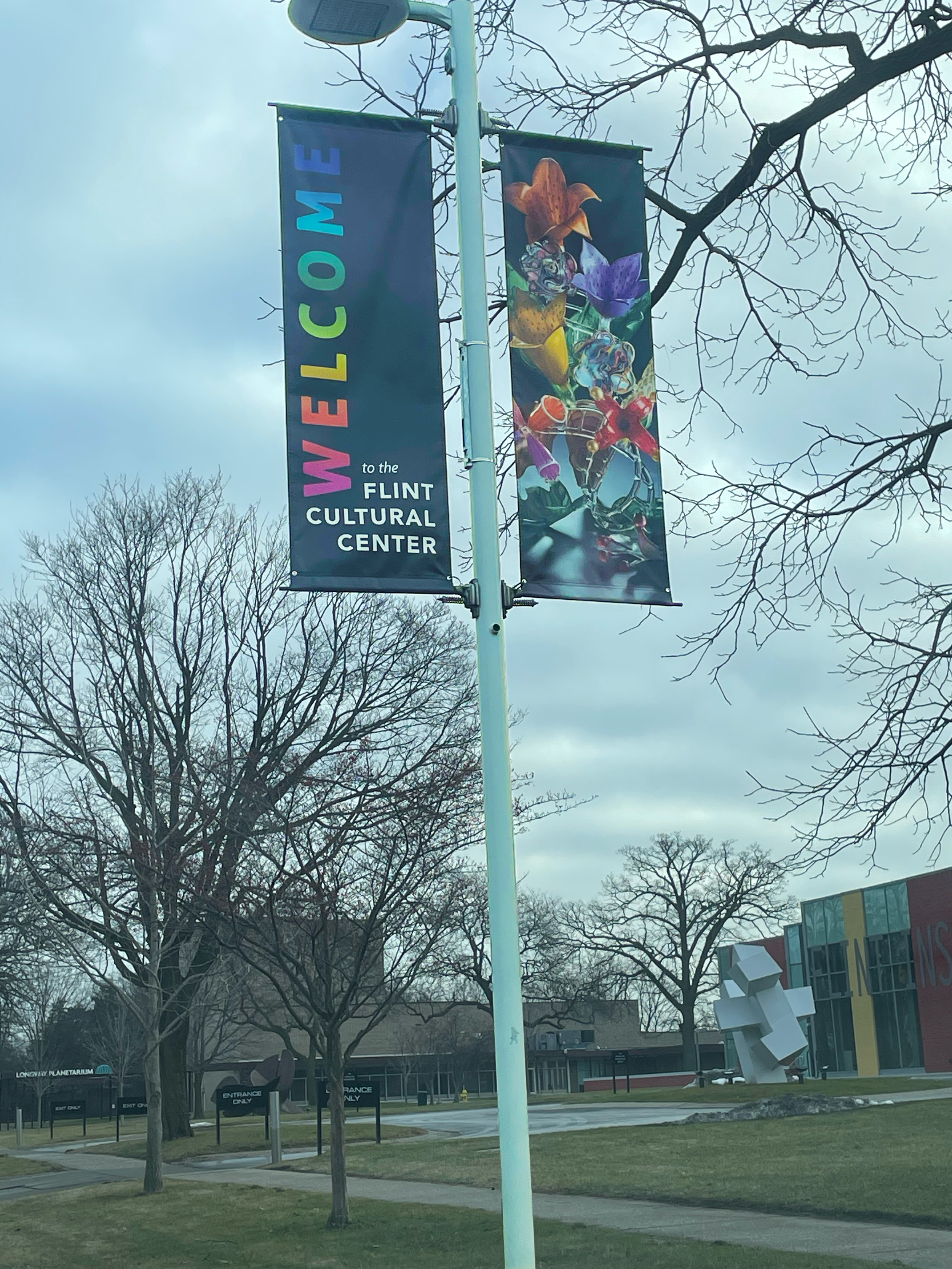
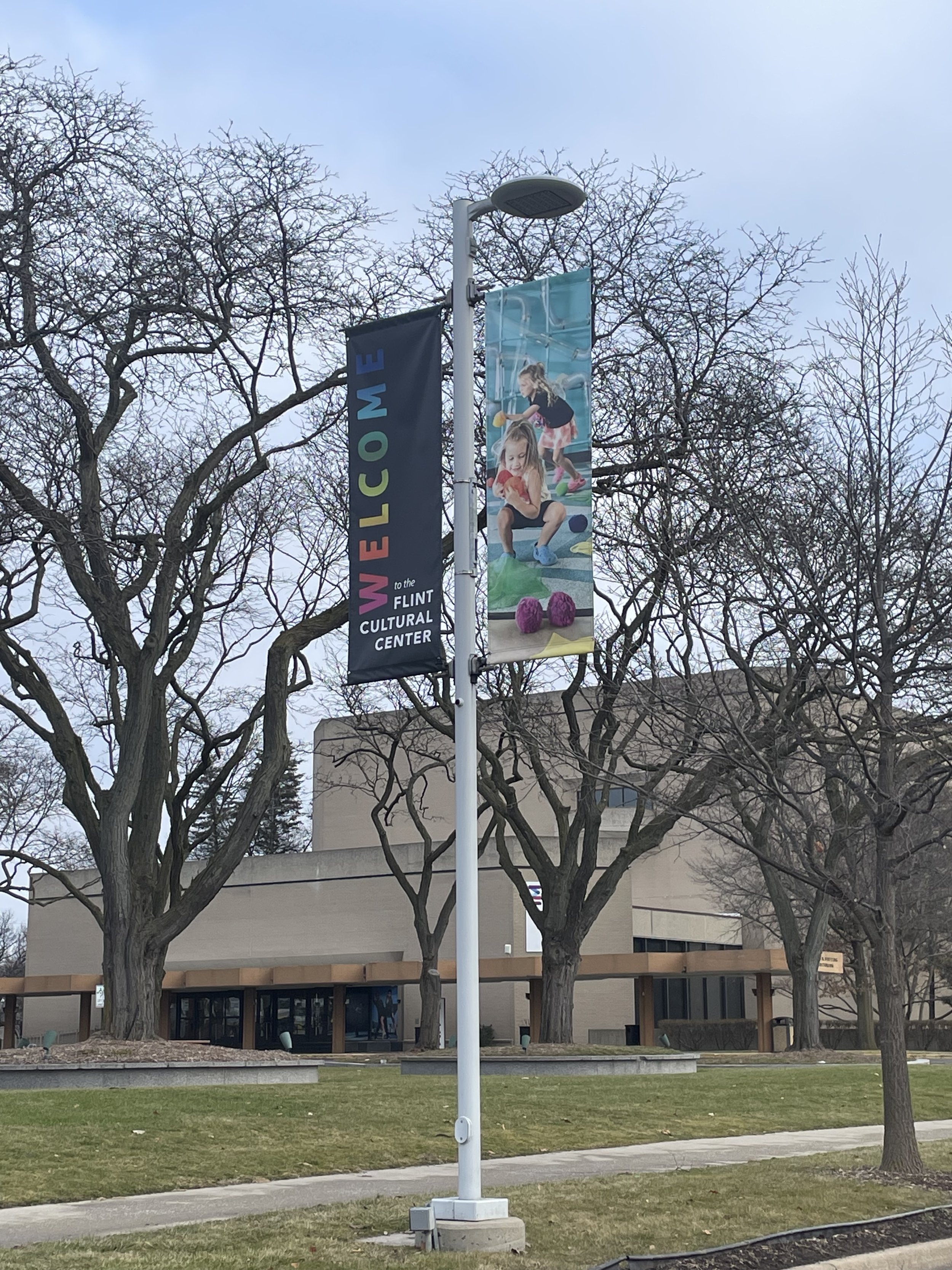
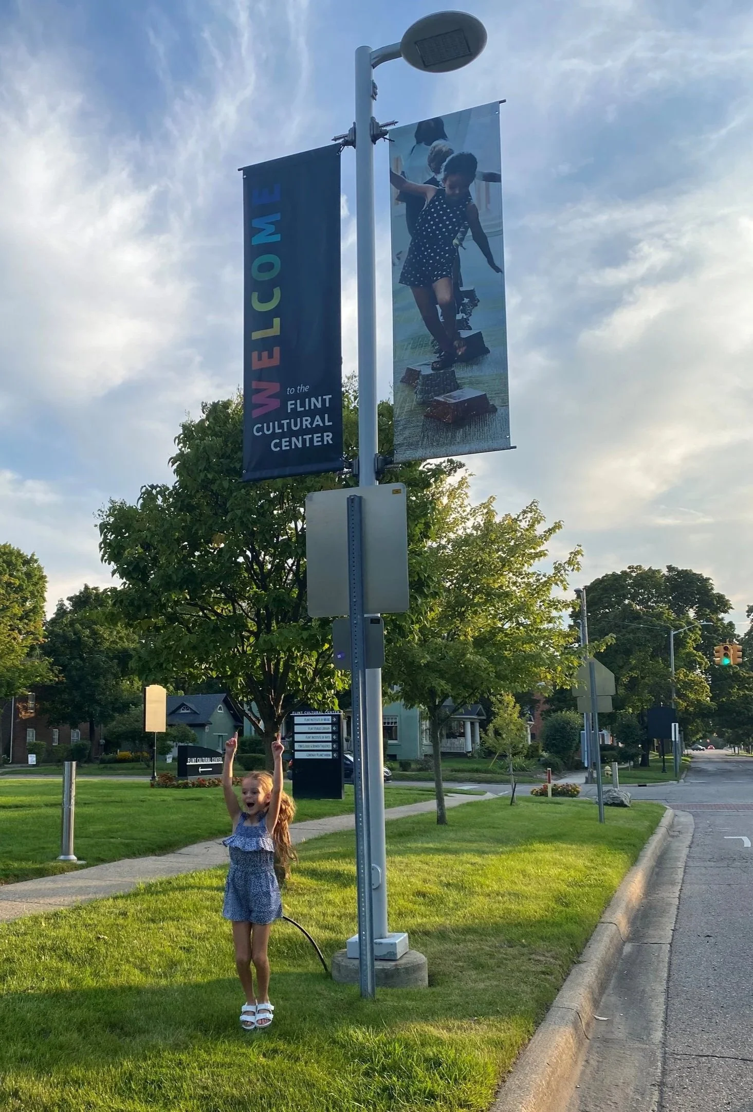
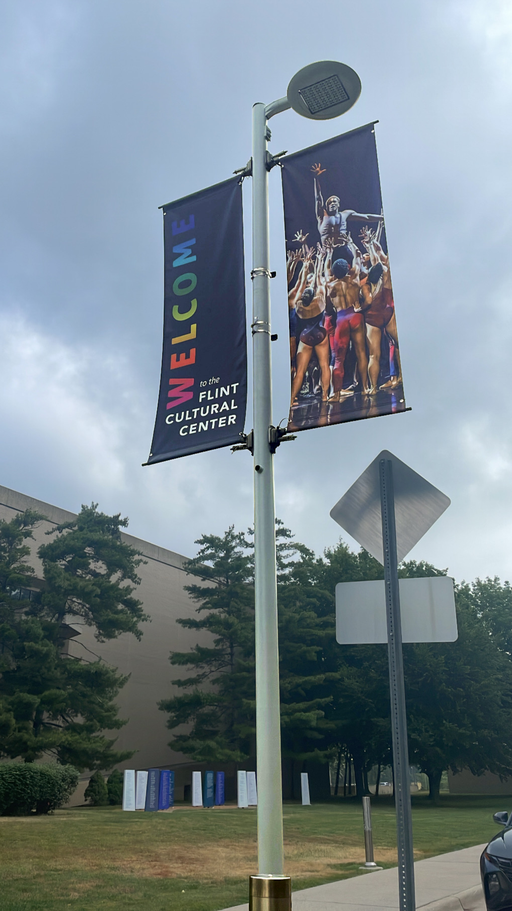
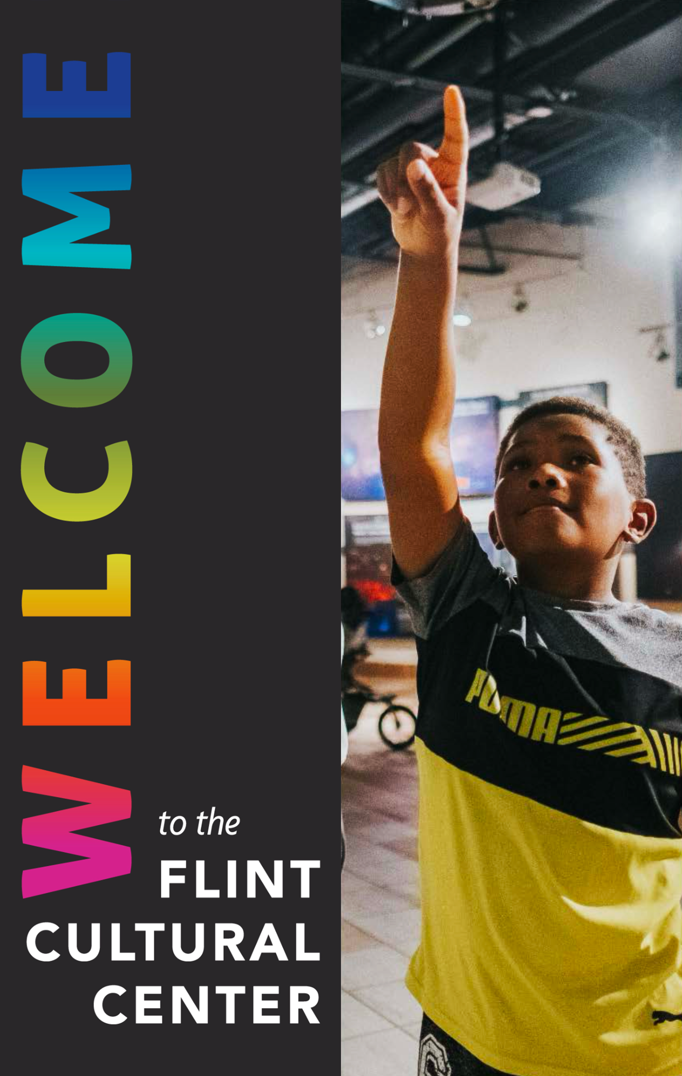
The banner system was designed as a modular two-part structure: a fixed vertical “WELCOME” banner paired with a separate full-bleed photographic banner. Separating permanent district identity from variable imagery allows seasonal photo updates without reprinting the core typographic banner, reducing long-term production costs.
Each photographic banner is double-sided with full bleed images on front and back to ensure visibility from both street and sidewalk perspectives. The consistent black typographic banner anchors all sixteen poles and echoes the black and font-style used in the Cultural Center’s ground-level wayfinding signage, reinforcing continuity across the broader environmental system.
-
The multicolored “WELCOME” draws from brand colors across the Cultural Center’s institutions, forming a shared spectrum that reflects the district as a whole. Rather than highlighting individual organizations, the system presents a collective identity centered on openness and access.
Photography features students, families, performers, sculptures, and artifacts from across the campus—placing emphasis on lived experience and cultural engagement. The banners signal that the Cultural Center belongs to the community it serves.
Design Process
*
Design Process *
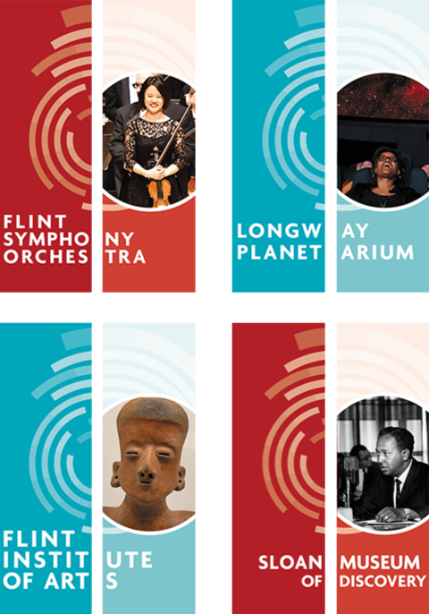
Review of Existing Conditions
The previous banner system relied on horizontal word breaks, circular graphic overlays, and institution-specific color treatments. Typography was divided across the vertical format, reducing legibility at distance and interrupting clear reading from moving vehicles.
As a group, the banners read as separate institutional graphics rather than a unified district presence.
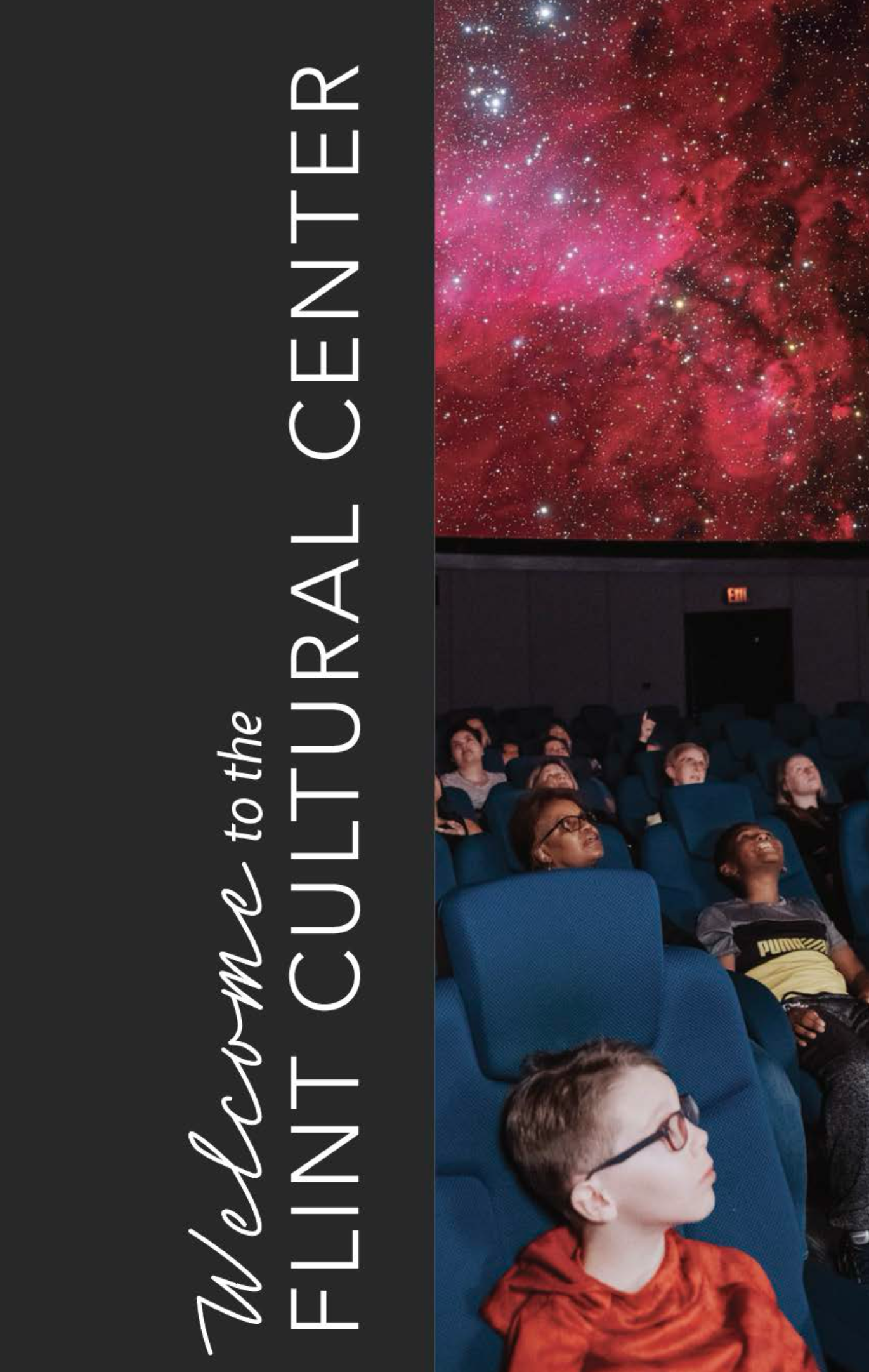
first iteration
The initial direction was intentionally restrained, using a strictly black and white modular system designed to frame rather than compete with photography. A vertical black panel drawn from the existing wayfinding palette anchors the composition while full-bleed imagery remains unobstructed. Typography reads vertically to maximize scale and long-distance legibility. A scripted “Welcome” introduces warmth while preserving clarity.
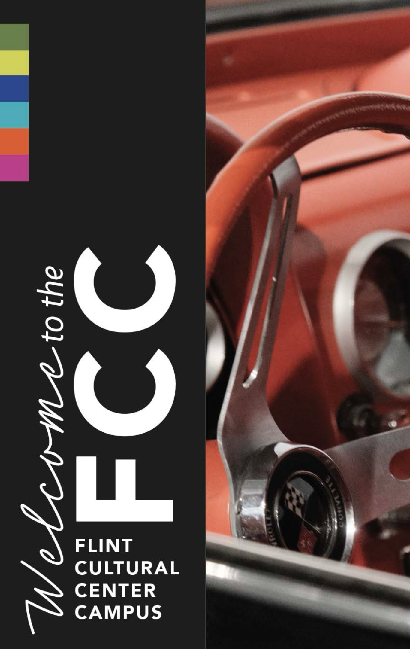
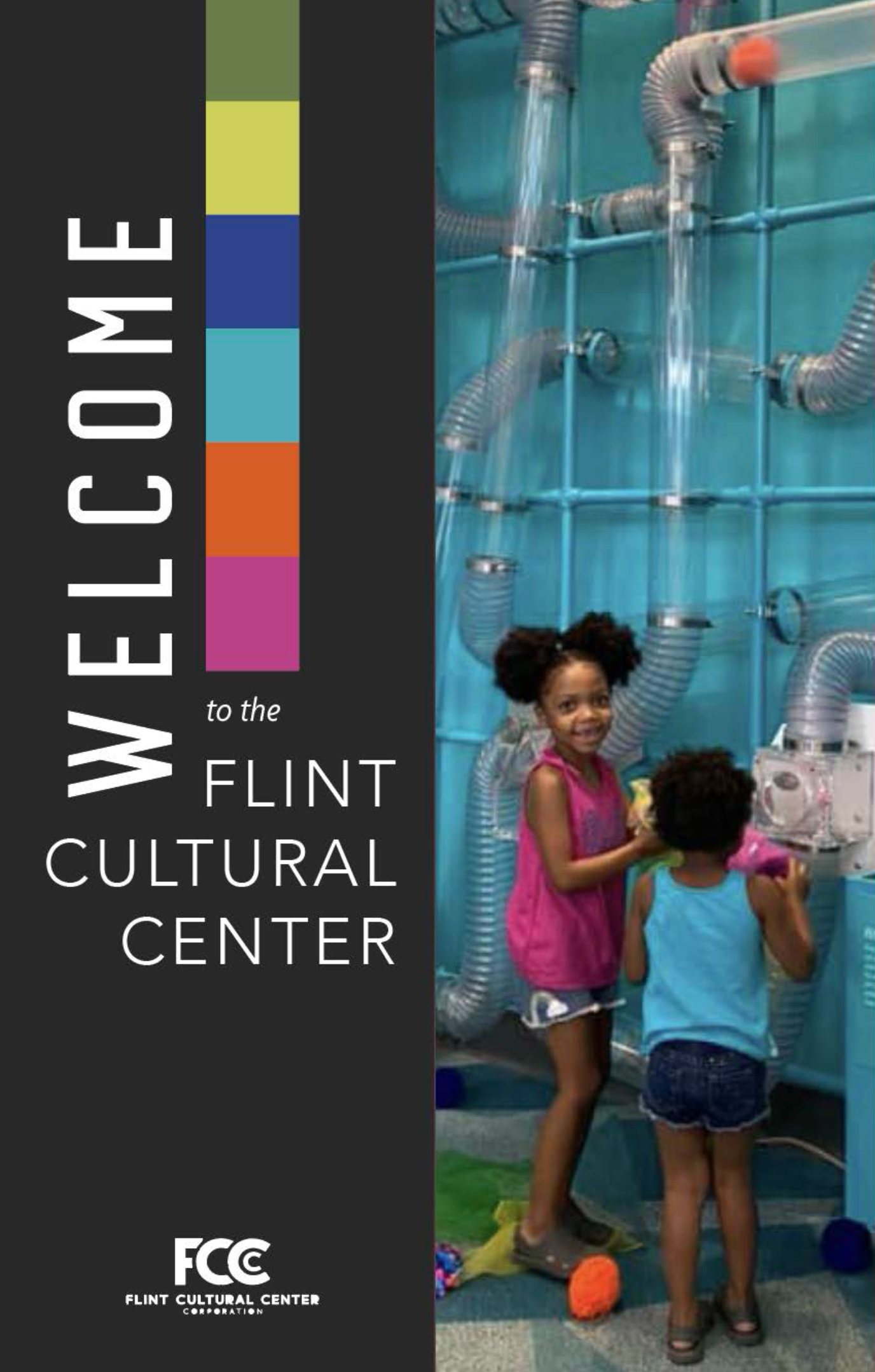
Second interation
The next iteration introduced institutional brand colors as concise vertical accents within the black panel. Each color acts as a subtle reference to a participating organization while maintaining a unified campus identity. Typographic hierarchy was further explored through shifts in scale and placement to test the system’s flexibility without compromising legibility.
Final design & installation
The final design integrates institutional colors directly into the primary typography. Each letter becomes a quiet reference to the organizations within the campus, strengthening collective identity while preserving the modular structure and uninterrupted photography. The result is a cohesive, scalable system that reads clearly from a distance and reveals nuance up close.